
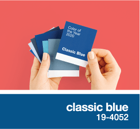
The Pantone Color Institute has announced the Pantone Color of the Year 2020 as:
PANTONE 19-4052 Classic Blue
USING PANTONE COLOR OF THE YEAR 2020 (CLASSIC BLUE)
IN LABELS, PACKAGING AND DESIGN
Classic Blue in design
Use Colour of the Year Classic Blue as inspiration for designs in fashion, beauty, home décor, web design and everyday products. classic blue offers the promise of protection, creating a stable foundation on which to build. It injects creative confidence into designs, transforming them with unique colour combinations and tonal statements that can be applied across many different materials, textures, and finishes. It is a dependable colour that can take you in many different directions, expressing tradition and elegance, as well as unexpected boldness.
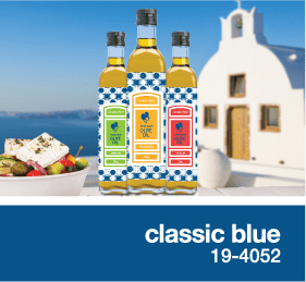
Classic Blue in labels
A poised and self-assured blue hue, elegant in its simplicity, genderless in outlook and seasonless in endurance. This anchor shade enables colour mixes throughout the spectrum, yet at the same time, makes a strong statement on its own. Emblematic of heritage but at the same time highly contemporary, it’s versatility will see it feature in products across a diverse range of industries.
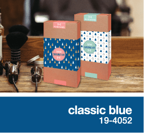
Classic blue in packaging Evocative of the evening sky, classic blue maintains a perception of dependability and constancy in what is sometimes an uncertain world. Colour of the Year Classic Blue is a colour we respond to viscerally as being trustworthy, it provides the ideal shade for packaging, where it conveys the credibility and reliability that today’s consumers desperately want to connect with. Mix your palette to create a dramatic statement or differentiate moods by varying your finish from glittery and glam to a dusty matte finish. |
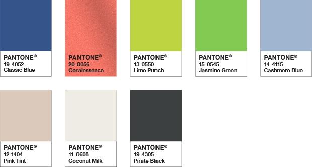
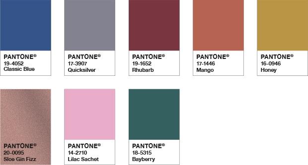
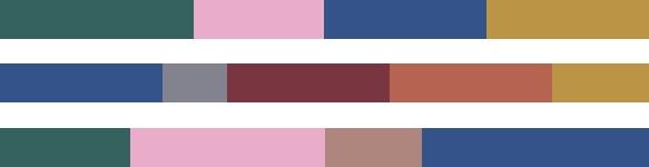
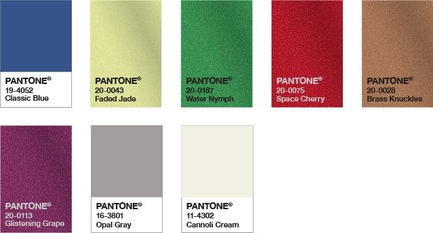
how to use Pantone color of the year 2020Use these colour palettes featuring classic blue to help bring your designs alive. Each palette conveys different moods, illustrating the versatility of classic blue.... or visit the Pantone site to see more |
Snorkel |
Evocative of a bliss-filled tropical paradise, snorkel transports us to an idyllic destination. Classic black and white create dramatic contrast as the palette unfolds it’s enchanting colour story. |

Exotic tastes |
An Intriguing and adventurous range, exotic tastes is reflective of natural seasonings, condiments and foods. Delicious colours associated with building a foundation for good health. |
Untraditional |
An unusual and unexpected palette of colours, untraditional sets the stage for unique combinations and fun colour mixes, as well as outrageous and surprisingly shimmery fashion |

Discover the colour of the year 2021 - CLICK HERE |